
APP STORE
ILLUSTRATION
SOCIAL MEDIA MARKETING
PROGRAMS USED:
︎ Figma
︎ Jitter
︎ Adobe Fresco
︎ Adobe Illustrator
OVERVIEW
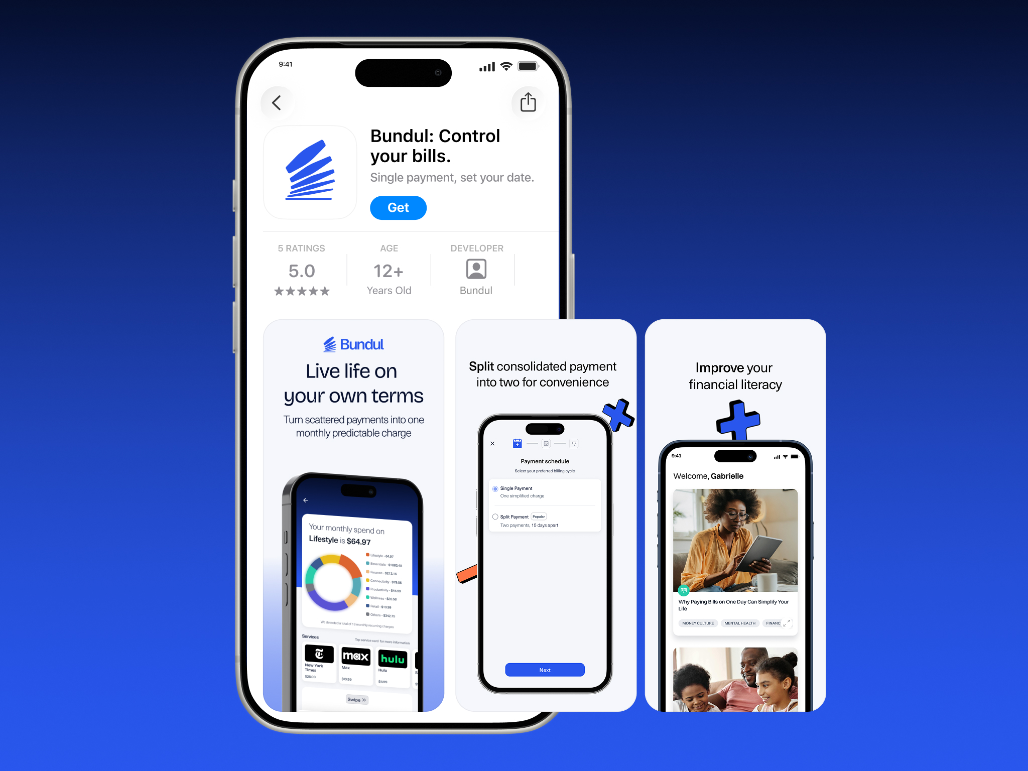
Bundul ↗ is a fintech app that consolidates payments for subscriptions and recurring bills, making financial planning and budgeting easier. I worked closely with marketing teams to design & implement social media content and rebranding across the social media platforms and app.
View my work:
︎ App Store
︎ Google Play Store
Social Media - Video
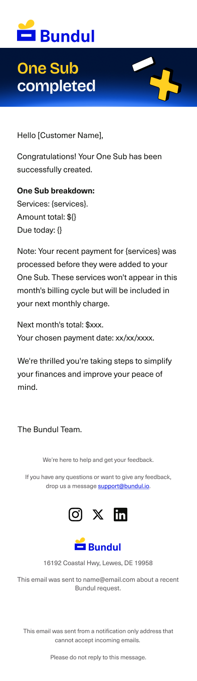
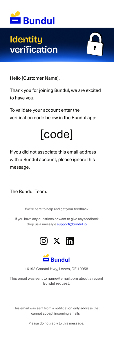
Email Designs

AVIANCA AIRLINES MOBILE APP
Experience a pleasant layover experience with a personalized itinerary.
ROLES
UX Designer
Researcher
TOOLS
Figma
Adobe Photoshop
TIMELINE
2 Months
OVERVIEW
Background:
Flight layovers are a major pain point to customers. During layovers, they’re often forced to endure boredom during ‘dead time’ at airport terminals. This issue is addressed by creating a digital experience through a mobile application.
The Goal:
Research, prototype, and build a digital UX/UI for a Star Alliance airline to improve the customer experience during passenger’s layovers.
Project Timeline
User-Centric Research ⌕
Stage 1
UI Design
Stage 2
Prototyping & Presentation
Stage 3
Stage 3
THE PROBLEM
Dead time during a flight layover. 🥱
Airline travelers are forced to spend hours waiting during a layover with a lack
of in-airport navigation & activities to pass the time. However, airline apps
do not address this issue on how they can create a schedule based on their needs.
MARKET RESEARCH
What are travelers thinking? 🧠
We brainstormed what goes through traveler's minds when they are at the airport.
This helps to understand their thought process and to generate survey questions.

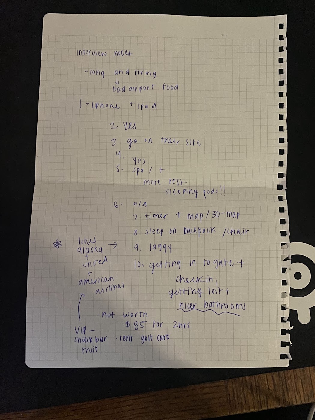
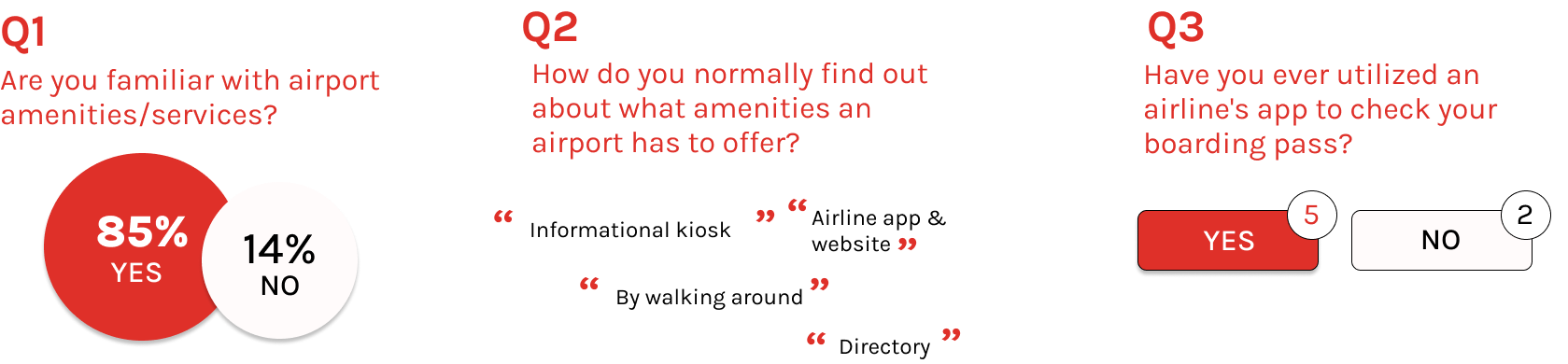
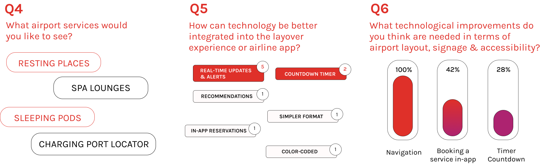
Survey & Insights ✏️
I conducted a series of 3 direct interviews with frequent flyers through in-person, one on one interviews
and a Google Form to provide an insight on what could be improved and the typical flying traveler's experience.
(Messy interview notes I wrote along w/ app
recommendations that the person interviewed liked)
![]()
recommendations that the person interviewed liked)
App
Deconstruction
![]()
Survey Findings
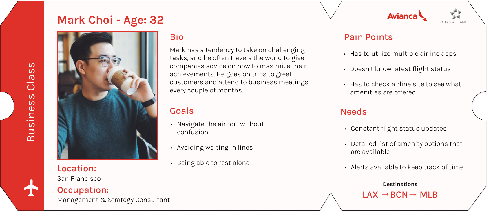
User Persona 👤
In order to gain insights on their pain points and potential gains, I created a user persona
to represent the target audience based on survey results.
User Journey Map 📌
I developed a journey map reflecting the current user experience to visualize
the process and identify stages requiring enhancements.
the process and identify stages requiring enhancements.

🌟
Key Insights from research and journey map:
01. Time Management
Frequent travelers who have flight layovers have
a need for timely updates and constant
reminders of time left before boarding their flight.
02. In-app booking & recommendations
Most airlines do not show what restaurants &
other amenities are offered on their mobile apps.
Most airlines do not show what restaurants &
other amenities are offered on their mobile apps.
Starting the Design
After brainstorming, I created low-fidelity wireframes on figma.

Style Guide
![]()
User Feedback Incorporated
Countdown Timer
Continously keeps track of the
amount of layover time that is left.
amount of layover time that is left.
In-App Booking
Book services in app rather than having to access third-party websites for each service.
Recommendations
Automatically recommends itinerary services based on pre-selected options.

Prototyping ︎
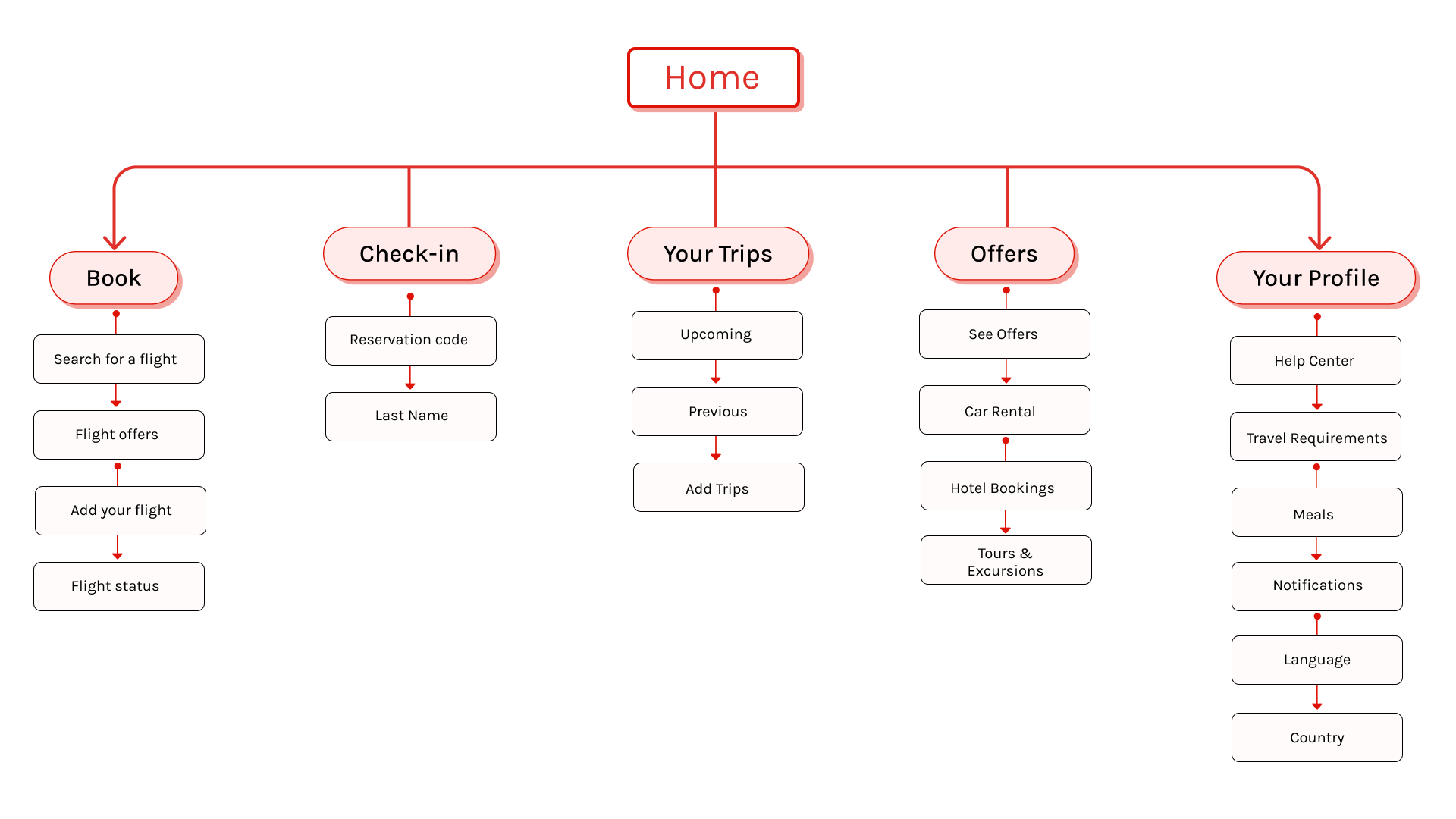
INTERFACE DESIGN
WEB DESIGN
FRONT-END WEB DEVELOPMENT
PROGRAMS USED:
︎ Figma
︎ Miro
︎ Wordpress
︎ Adobe Illustrator
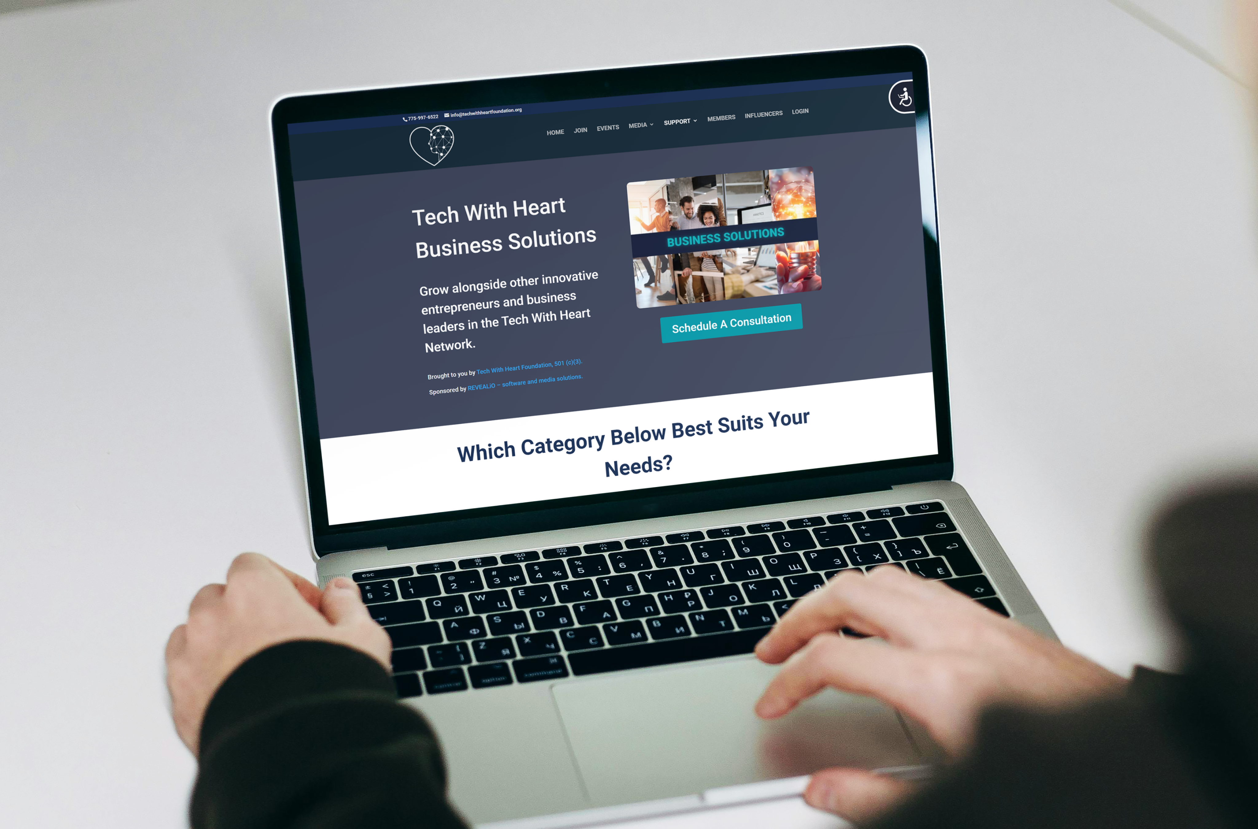
Tech With Heart ↗ is a nonprofit empowering businesses in a digital era through community, leadership, and emerging technology.
As a former intern at Tech With Heart, I’ve had the opportunity to web develop and design the variety of webpages including: events, 3d workspaces, business solutions, business systems, and marketing/sales.
Additionally, I supported the marketing team by creating assets for socials, web, and print.
ROLES
UI/Front-End Designer
Graphic Designer
UI/Front-End Designer
Graphic Designer
TEAM
3 Designers
1 CEO
3 Designers
1 CEO
TIMELINE
4 Months
4 Months
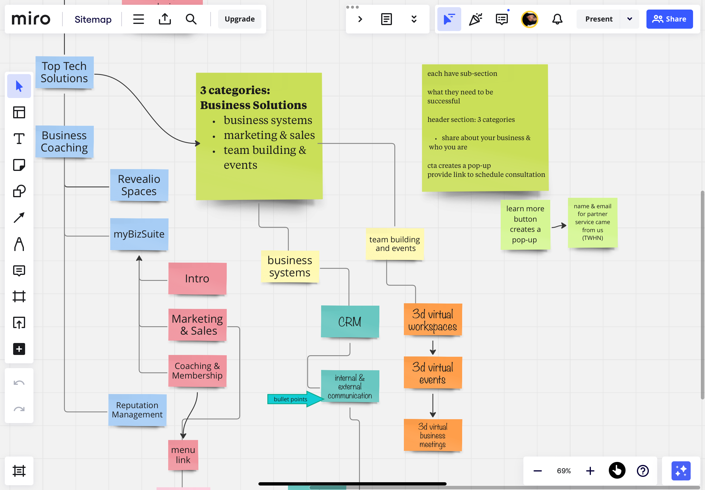
Visual Sitemap for Pages
Figma Design Overview

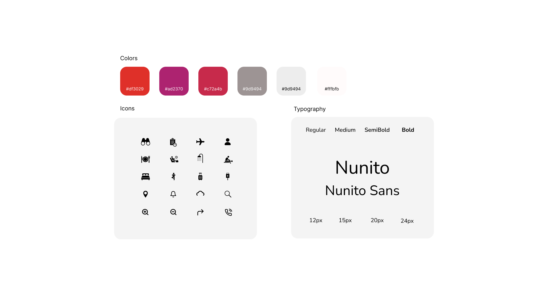
The designs on Figma follow Tech With Heart’s brand guidelines, specific text styles with H1’s and H2’s, as well as CTA buttons that offer business solutions.
Prototyping ︎
TAKEAWAYS
What I've learned during this process
Impactful design solutions
The design solutions significantly improved user interaction and team efficiency.
Collaborative Approach
Since we were all working remotely, it was crucial that we communicated efficiently during our weekly check-in's. This helped us keep in check and stay on the path to meet our goals.
Measuring Sucess
Using structures to web develop on the front end is vital, and this internship taught me the value of columns and sections. Even though I didn't know much about web development at first, I took the time to learn something completely new. With that being said, this experience showed me the value of creating consistent webpages that align with the company’s brand.